I’m glad to say that this is the first article for pixelpinch.
This article shows how pixelpinch website’s logo was developed. The total process took 3 to 4 hours. Within this time a logo was produced from a scratch to the present state. I should have given more time to it but one cannot say the artwork would be better if given more time.
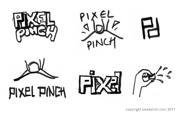
First of all, I sketched the ideas I had in my mind. I didn’t take any reference from any sources as I wanted to keep the logo unique. But this can be a wrong step if you are developing logo for any big organizations as its competitor might have similar logo. Therefore a thorough study is must before beginning of sketch. These are some result I came upon.
Among these sketches, I liked the one with finger pinching a box or pixel. It clearly shows pinching and the hand posture is similar to alphabet ‘P’. Then focus was only given to this style.
After few sketches, I decided it to continue in computer. I used Corel Draw to produce it. The reason why I chose Corel Draw is that I can produce vector artwork and I have more experience in it than the Adobe Illustrator which is also similar application.
First logo was bit cartoony and colourful. It looks good individually but is completely out of theme. And it didn’t go with the website too. Then I decided to change the colour to suit the website. I also changed the hand to white as if it was wearing glove. But I was not satisfied.
Finally I decided to make the hand a bit abstract. The final output was liked by my friends and I did like it too. This is how pixelpinch logo was completed. If you have any suggestion for the logo or have any similar stories, please leave a comment below.
[line]

Leave a Reply